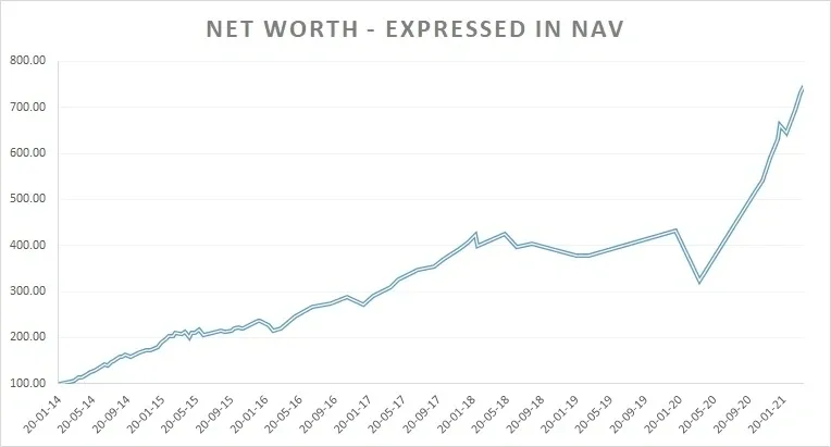
This has been the trajectory of my net worth, expressed in NAV terms since 2014.

My net worth is up almost 7.5x over the 7-year period, it has grown at a rate of 32% p.a. Please note that this is not the return on my equity portfolio, this is the rate at which my net worth has grown since 2014.
This can either be impressive or just about average depending on what the starting point was and what my annual operating annual income has been in proportion to the starting point.
If my starting point was INR 20 lakh and my average annual income has been 30 lakhs, this is an average trajectory at best. I’d have earned 2.1 Cr cumulative pre-tax and pre-expenses but managed to add just 1.2 Cr to my net worth over the 7-year period. This either means that my investing was below par or that my savings rate was below par, or worse, a combination of both.
But if my starting point was INR 1 Cr and my average annual income has been 40 lakhs, this is pretty good. I’d have earned 2.8 Cr cumulative pre-tax and pre-expenses but managed to add 6 Cr to my net worth over the 7-year period. It is very likely that both my investing and savings rate were up to the mark.
See how incomplete data can lead to unreliable conclusions?
Which is why focusing only on what the annual return is on your portfolio rarely tells you how well you’ve been doing. What if your investment portfolio grew at 40% p.a. but you hardly had 10% of your net worth in investments and had the rest locked up assets that hardly grew at 8% p.a.?
Sit back and think about that for a while. If you get asset allocation wrong it is very difficult to compound your net worth at a healthy rate.
Always track the rate at which your net worth has been growing in addition to what your investment return has been. One without the other doesn’t reveal much if investing well is a priority for you.
Why am I posting this rather personal chart here?
So that people can get a sense of how volatile the investing journey can be. The very fact that I have been tracking my net worth regularly since 2014 should tell you how serious I have been about this endeavor, well before I started seeing investing success.
Unless you prioritize something, you are unlikely to see good results in that aspect of life.
You can’t complete a half marathon unless you train for one.
It is very easy to look back at someone who is already wealthy and comment on how simple it must have been and how he/she was a beneficiary of a tailwind. The issue is that tailwinds become obvious only in hindsight and are never that obvious as they are playing out. Observing a process real time is very different from viewing something through the lens of hindsight after the outcome is already known. That is the beauty of an exercise like this one, this is unlikely to misguide anyone since it is happening real time. I am as clueless as you are in estimating what the outcome will be 5 years down the line.
An observer can experience to some extent the emotions, exuberance and volatility of this journey; provided I continue to post timely updates. Which I will, for the simple reason that I don’t see too many folks doing this.
We have too many people bullshitting us on wealth creation these days. Especially those who shoot their motivational YouTube videos in front of a swanky sportscar they rent for an hour or two. They are also prone to updating their social media profiles with pics at the beach and at 5* hotels. Attend a 2-hour seminar/webinar and learn a few tricks that will help you compound your wealth for the rest of your life. These folks are so rich and successful that they want you to pay them two thousand bucks for a life changing 2-hour course.
If you fall for this you very much deserve the shit coming your way.
Going back to the chart..
Observe the period from 2018 till mid of 2020. The damn graph hardly moved an inch for almost 2.5 years, the only reason the graph did not dip till the COVID crash of March 2020 was because I had a steady operating income. My operating income during that period was subsidizing the MTM losses my investments were taking. Those were the exact years when my small & micro-cap portfolio underperformed the indices by a big margin, you can see this in the historical performance page.
However, from June 2020 you can see the chart go on steroids till the end of the FY. Delayed gratification, step functions, perseverance and virtuous cycle all rolled up into one hell of a year after a tumultuous period starting March 2020. One could say this more than made up for the patchy period prior to this. This is how I know I’ve learnt my lessons and gotten better since 2018. The proof of the pudding is always in the eating.
For most first-generation folks, this is how the journey is expected to go. Never linear, always inducing self-doubt till you see the payoff and hop onto the next level. As for how step functions in the context of wealth work, you should revisit this post.


